Showing posts with label faux leather. Show all posts

Monday

Jenny's Jewelry Box Makeover


You'll hear me say this over and over again...I LOVE TAKING SOMETHING OLD AND MAKING IT NEW AGAIN!  Like, it's an addiction for me.  When I first started painting furniture I used to plan, draw things out, create different color combinations, blah, blah, blah! But as my business grew time became short, so I just started to "wing it" and the results have, for the most part, been pretty cool.  Now, that's not saying I haven't switched up mid way through a design, just because something didn't sit right with me, but for the most part the "freedom to create" mentality has been working pretty well for me.  Especially, when a flexible, open minded person gives me "free range" OH, HOW I ADORE THOSE PEOPLE!  Case and point; Jenny's Jewelry Box!


I had done other work for Jenny (see her owl mirror here) and she had mentioned she had a jewelry box that she wanted to have redone.  "Well, absolutely! Bring it over!" I said.  Always up for a challenge!  I actuallly had never "done or redone" a jewelry box of this size before!  I have done a million smaller ones but never one this large and when she plopped it down in my foyer, I thought, hmmmm...what a fabulous piece.  The thing was though, I felt limited in my design because of the "Greek Styled" scalloped top and pillars.  So, I had to think about my approach for awhile.


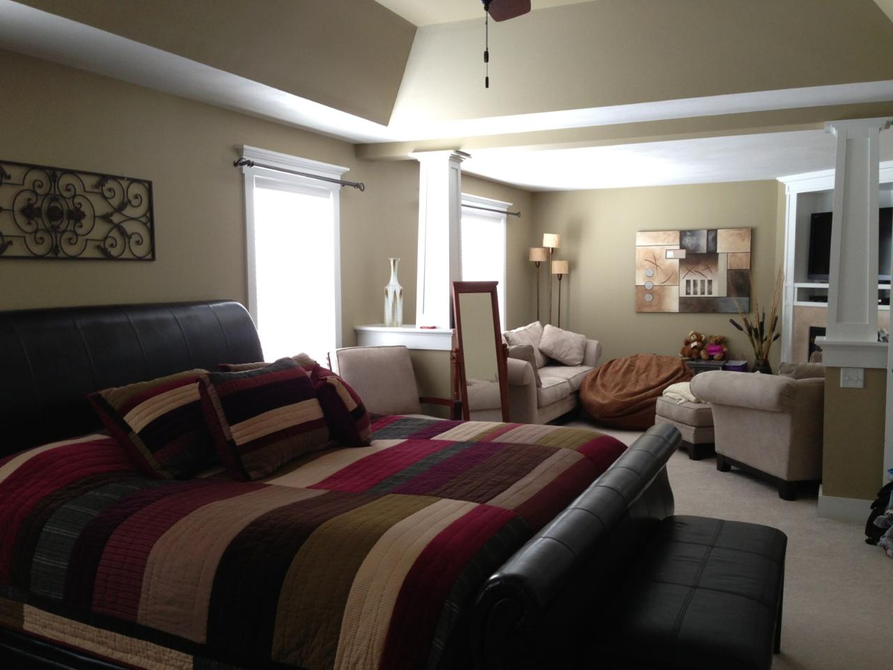
This was the space that it was going in.  So, I knew the colors had to be a bit deeper and more richer than the pieces I usually do.  It was time to grow up a bit.  I loved the the leather and iron fixtures and furniture, so I knew those had to be incorporated some how. BUT I do know Jenny too, and I knew it had to be playful and fun as well.  


I decided to go with a "faux" leather look (see the tutorial here) on the pillars and legs.  Then brought in the "iron" look by spraying the hardware black.


The playfulness is found in the Cheetah print on the side and the decorative elements through out.


  The really cool thing about this jewelry box too, is all the hidden surfaces, things you don't necessarily see right away.


My most favorite part of this piece, the one that just kind of evolved, was the top.  I wanted to personalize it, like I do my smaller jewelry boxes but yet, I wanted it to be more sophisticated, so I chose her initials  and then built my design around that.


There you have it!  


How do you tackle your "redo" projects?  Do you just wing it or do you plan it out?  Do you choose colors first, or just let it evolve?  I'd love to hear your ideas!  Write me here or leave a comment on our Face Book page!


Tuesday

In Harmony With Spring


I recently decided to give two of my pieces to the Rotary Club of Eastwood to be auctioned off for charity.  It’s a cool way to give back to the community. Know, before you go thinking I’m this amazing giving person, it’s also a way for me to get my name out there as well (it’s a win/win). In return for the donation you get your name (and a picture of a couple of your pieces) in their glossy 8 X 10 magazine, pretty fancy, hugh! When you check out their website, oh and I know you will, (http://www.eastwoodrotary.org/) you’ll be able to actually see a copy of the magazine online. I personally picked up 25 copies for myself, not sure who I’m handing them out to, family and friends perhaps? Hahahaha! (I can hear them all groaning now!) Anyway, it was a lot of fun to do the pieces, you know me, any excuse to paint something!

Here’s the first piece. It started out as this "cuteugly" table. Cute when I first did it,  but ugly now that I look at it! You know what I'm talking about! You've all been there. My painting has grown and matured over the years, so a lot of my earlier pieces look silly to me now, but I still love the phrase on it though! It’s great isn’t it!


So, as always I primed it down. I had to sand the dots on the legs because they were a bit heavy (she said in a very critical voice). Next, I taped off the areas I was going to crackle (see http://thedecorativepaintbrush.blogspot.com/2010/12/girl-can-change-her-mind.html for a more detailed tutorial). I base coated in a tan, ragged off (painted on the brown with a brush, then took a rag and pulled paint off in a random fashion) with a darker brown (Ben Moore Roasted Coffee Beans 2098). Then I applied the One Step Crackle Medium by Deco Art. Dried it with a blow dryer to speed up the crackle process, then I wiped Minwax stain in Red Mahogany #225 over the surface to fill in the cracks and give it a deep rich leather feel.  I did this step on the legs as well.


Then when it was dry I pulled the tape and started painting the center parts. I laid down the base coat first then when back in and started to draw out and tape off where I wanted the designs to be.


I had recently gotten a Cherry Blossom stencil and knew I wanted to use it. Spring has finally arrived here in New York and I really felt like conveying that through this piece and felt like the cherry blossom stencil would really help me do that.  The great color palette of pinks and greens coupled with the earthy brown just pulled the look all together.  So, when I was looking for a word to go on top “Harmony” just seemed like the perfect choice!


Well, I’m hoping someone will love this piece enough to bid on it. I’m really hoping it brings in some money for the Rotary Club and all the wonderful charities they donate to throughout the year.  If you get a chance, really, check out all the other great artists that are participating in the show! http://www.eastwoodrotary.org/ I’m stoked to be a part of it.  Look for the second piece next week. Peace!

Cost: Table was free (given to me by my sister-in-law)


Colors Used: Benjamin Moore

  • Pink Ladies 1347
  • Island Sunset 1346
  • Bermuda Breeze 1345
  • Dark Celery 2146
  • Olive Tree 390
  • Roasted Coffee Beans 2098
  • White Dove

  • Minwax Stain Red Mahogany 225
  • Reeves Acrylic Metallic Silver

Happy Painting,

Mary