Tuesday

In Harmony With Spring


I recently decided to give two of my pieces to the Rotary Club of Eastwood to be auctioned off for charity.  It’s a cool way to give back to the community. Know, before you go thinking I’m this amazing giving person, it’s also a way for me to get my name out there as well (it’s a win/win). In return for the donation you get your name (and a picture of a couple of your pieces) in their glossy 8 X 10 magazine, pretty fancy, hugh! When you check out their website, oh and I know you will, (http://www.eastwoodrotary.org/) you’ll be able to actually see a copy of the magazine online. I personally picked up 25 copies for myself, not sure who I’m handing them out to, family and friends perhaps? Hahahaha! (I can hear them all groaning now!) Anyway, it was a lot of fun to do the pieces, you know me, any excuse to paint something!

Here’s the first piece. It started out as this "cuteugly" table. Cute when I first did it,  but ugly now that I look at it! You know what I'm talking about! You've all been there. My painting has grown and matured over the years, so a lot of my earlier pieces look silly to me now, but I still love the phrase on it though! It’s great isn’t it!


So, as always I primed it down. I had to sand the dots on the legs because they were a bit heavy (she said in a very critical voice). Next, I taped off the areas I was going to crackle (see http://thedecorativepaintbrush.blogspot.com/2010/12/girl-can-change-her-mind.html for a more detailed tutorial). I base coated in a tan, ragged off (painted on the brown with a brush, then took a rag and pulled paint off in a random fashion) with a darker brown (Ben Moore Roasted Coffee Beans 2098). Then I applied the One Step Crackle Medium by Deco Art. Dried it with a blow dryer to speed up the crackle process, then I wiped Minwax stain in Red Mahogany #225 over the surface to fill in the cracks and give it a deep rich leather feel.  I did this step on the legs as well.


Then when it was dry I pulled the tape and started painting the center parts. I laid down the base coat first then when back in and started to draw out and tape off where I wanted the designs to be.


I had recently gotten a Cherry Blossom stencil and knew I wanted to use it. Spring has finally arrived here in New York and I really felt like conveying that through this piece and felt like the cherry blossom stencil would really help me do that.  The great color palette of pinks and greens coupled with the earthy brown just pulled the look all together.  So, when I was looking for a word to go on top “Harmony” just seemed like the perfect choice!


Well, I’m hoping someone will love this piece enough to bid on it. I’m really hoping it brings in some money for the Rotary Club and all the wonderful charities they donate to throughout the year.  If you get a chance, really, check out all the other great artists that are participating in the show! http://www.eastwoodrotary.org/ I’m stoked to be a part of it.  Look for the second piece next week. Peace!

Cost: Table was free (given to me by my sister-in-law)


Colors Used: Benjamin Moore

  • Pink Ladies 1347
  • Island Sunset 1346
  • Bermuda Breeze 1345
  • Dark Celery 2146
  • Olive Tree 390
  • Roasted Coffee Beans 2098
  • White Dove

  • Minwax Stain Red Mahogany 225
  • Reeves Acrylic Metallic Silver

Happy Painting,

Mary


Monday

Moroccan Stenciled Steps


I love painting furniture! But as you know, my day job is painting inside homes. On our other business blog http://2womenandapaintbrush.blogspot.com/ I usually blog about those projects but this one was so much fun I had to share it here as well.


The customer wanted to do something fun with her steps. She had seen an interesting treatment on another blog and wanted to know if we could duplicate it? Hahahaha! I laughed loudly (and flung my hair wildly over my shoulder) "Of course I can!"


She ordered these Moroccan stencils online and we got started painting the steps in 2 sets of blue and 2 stets of white etc.....


We knew we had to cut the stencils down in order to cut down on "fussing" time. Once we did that the process went very quickly.


2 of the stencils had very thin lines and when you stencil with paint it's very easy for the paint to bleed under the stencil, so when we were finished we had to go back and touch up with a tiny paintbrush just to freshen things up.


The end result was Fabulous! We were as excited as she was! Even though I couldn't stand straight for hours (sitting on a small step, twisted around, does a number on your spine), it was so worth it!


Sunday

Sing Out Loud

This was one of the first tables I ever did. It was one of the reasons I started The Decorative Paintbrush. Looking back on it now, it’s amazing to me how much my “style” has changed. It’s not that I didn’t like the first design; I just felt it never matched the fun curves of the table. Even after it was finished (the first time) I always knew I would repaint it at some point. That’s the great thing about paint, especially for a fickle girl like me; you can always change your mind.

So, I sanded it down, primed it and drew out my idea. I had seen a blue on blue leopard print fabric while searching for fabric, for another chair and knew that I wanted to use it in my next piece. Since I had just bought the Blue Lapis & Twilight Blue for the harlequin pattern in the nightstand it was pretty much a done deal.

I had also just purchased two other colors on a daily trip to our local paint store http://www.purcellpaints.com/  Olive Tree & Golden Delicious and felt they would make a great addition to the blue.

So, on and on I went, into the center, creating different patterns, meshing things together and then, I kind of hit a road block? Brain Fart…if you will. I just stood there looking at a white circle. When this happens I usually draw things out on paper. It gives me a visual, something to look at, yet I’m not committed. I drew out four different center ideas and played with them a bit. As you can see from the final product I chose the bird. (It reminds me of my girls who despite not being able to carry a tune, strap on an IPod and sing at the top of their lungs, no matter who’s listening, which I love about them).

I also added a finial and small circle plaque to the center of the intersection at the bottom. It was pretty plain before that and I felt adding the finial would give it some funk. I painted the plaque first, screwed in the finial, then Gorilla Glued the entire center piece to the middle. It really pulled the top and bottom together.

So, this piece was free (it was a side of the road find), we paid $.79 for the plaque and $2.79 for the finial. The paint was probably about $3.00-$4.00, because again I buy small pints and reuse colors as often as possible. Total cost is under $8.00. How awesome is that!


Colors used:

Benjamin Moore:

390-Olive Tree
392-Golden Delicious
2067-40 Blue Lapis
2067-30 Twilight Blue
2077-10 Magenta
White Dove
Valspar Black


Happy Painting!

Mary

The Stylish Blogger Award

Friday I was pleasantly surprised with a Stylish Blogger Award from Pamela of Becolorful http://becolorful.typepad.com/ Although, Pamela and I are new admirers of each other’s work we are like kindred spirits, both in love with color and funky designs.


So, I was honored when she passed on this award to me, but along with this wonderful award comes the task of coming up with 7 things that are interesting about me! LOL! Now…although, I’d love for all of you to think I live this fabulously exotic, artistically filled, culturally charged life, I’m afraid I don’t. Oh, my life is extremely busy, some days it’s practically insane, but interesting? Hmmmm….

Well, here are the 7 things I could come up with! Hold onto your hats, and have a seat, you my friends are in for a crazy ride….Here we go!

1. I have 5 kids! Yep, you heard me 5! They range in age from 24-13 (2 boys/3girls) You can read all about us in our other blog http://2moms5kids.blogspot.com/ I started writing the blog in order to keep track of all the craziness that goes on in our life, and boy does it get crazy! Actually we should have a reality TV show…Not to be full of myself, but you’d tune in, you really would! We’re that crazy!

2. I love to write! Four years ago I completely finished my first romance novel Vanilla Summer. Its 34 chapters and I loved writing it. It’s partially based on my own life. I think we all have a book inside of us, we just need to get it out on paper! Now, trying to find an agent that’s been the hardest part of the process. I’m also working on a poetry book with my 13 yo., (Mom, Me & Poetry ) she writes amazing poetry and I’m doing the illustrations to go along with it. I’m also pitching another book on, you guessed it, redoing furniture! In the mean time these blogs plus our other business blog keep me writing weekly!

3. My formal education… Although I have an AS in Art, my BS is actually in Psychology/Special Education. I spent very little time in a classroom though, because just after I finished up my education Maggie and I started our 1st business. (That $40,000 degree actually helped me navigate the special education system for my own children though, so it wasn’t a total wash, LOL!)


4. I collect a lot of things. My two favorites are Crosses and Hello Kitty. Hello Kitty speaks to the little girl in me, the crosses are beautiful & symbolic. My kids think its creepy.


5. I’ve started 2 businesses from scratch. 2 Women and a Paintbrush http://2womenandapaintbrush.blogspot.com/was started in 2003 and has raised a family of 7 which in today’s economy, ROCKS! We are women owned and operated which says a lot, since this particular area of work is pretty much dominated by men, but Maggie and I hold our own! We have learned a lot, met a lot of great people and have grown both professionally and personally in so many ways. The Decorative Paintbrush is our love child :D

6. I’m addicted to tattoos! I have 3 (getting my 4th in a couple weeks)! Although I am not brave enough to do a whole sleeve or anything like that, I love little, personal ones. Ones that show up all over the place when you least expect them. You know the kind, on a wrist, behind the ear. I believe they should be personal too, have meaning. The one on my wrist: Kanji symbols for artist. One on my ankle: My favorite bible verse 1 Cor 13:8 “Love Never Fails", I got it for my middle daughter, when we were going through some struggles. Then the one on my arm that symbolizes the 2 most important things in my life: Faith & Family. My fourth one will be on the back of my neck: hearts with wings and “te voglio bene” underneath, which my grandmother used to say to me “I love you” in Italian. I always put the wings and heart on all my furniture too, because it reminds me of her, it’s symbolic for me, she was a great lady.

7. And finally number seven…..I HATE rude people! HATE, HATE, HATE! There is just no reason for it. I have such a low tolerance for rudeness and ignorance; it would blow your mind! LOL! Not that I’m Ms. Susie Sunshine, Rose Colored Glasses Lady, cause I can be as ornery as the rest of ya, but I just think that this world is awful enough on its own , and if we just tried a little bit harder, to be just a little bit nicer, things might be just a little bit better…are you feeling me people :D

Okay, so that’s my service announcement part of the quest!

So, remember to stop by and see Pamela @ http://becolorful.typepad.com/ then make your way over to these 10 fabulous people! I will be bestowing this wonderful award onto them next. Please, if you get a chance check them out, you'll be doing yourself a favor. Some you may have seen before, some you may have not, but they are all worthy of your LOVE! LOL! Later, everybody!

http://2womenandapaintbrush.blogspot.com/Maggie gives great tips, before and after pictures on the redoings (is that a word?) of people's homes!

http://chrissiegrace.blogspot.com/ Chrissie has fantastic, colorful signs, that you will just love! Her book is outstanding and a must have!

http://myrepurposedlife.blogspot.com/ Gail is amazing! Always posting something new! I'm sure you've all heard of her!

http://rasjacobson.wordpress.com/ This blog, although not a craft blog is a wondeful advice blog on school, parenting and teaching. Renee is a dear friend and a wonderful teacher you'll enjoy her stuff!

http://burlapluxe.blogspot.com/ Although my work is wild and colorful, I do have a softer side and secretly love washed out whites and romantic fabrics. This blog speaks to that.

http://chrissiescollections.blogspot.com/ Chrissie does really great things with once loved furniture too!

http://www.junkrestore.com/ Great blog! Fun & funky ideas for vintage stuff!

http://www.inthefunlane.com/ You knew I'd have a lot of furniture redo blogs right! These guys have some really fresh ideas to take a look at.

http://somedaycrafts.blogspot.com/ Oodles and Oodles of amazing craft ideas

http://mollysusanstrong.blogspot.com/ Okay, one more amazing furniture artist!

Wednesday

Where Do You Find Inspiration?

MacKenzie-Childs Chair
Over the years people have told me that my work reminds them of MacKenzie-Childs. Now, I take great pride in that, because their work is amazing, and to even be remotely thought of, even in the same sentence, is hugely complementary.


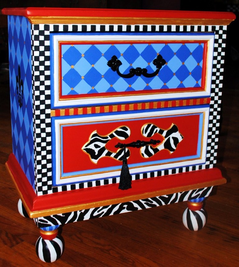
Every month the catalog comes to my house and I devour it, cover to cover, absorbing it like some type of junkie trying to get a fix. This time around I was inspired by this beautifully overstuffed chair and it’s blue on blue harlequin pattern. Now, I can paint, but I CAN NOT reupholster, so I decided to use this piece as inspiration for an end table that had been marinating in the studio for awhile.

Before we begin, I want to let you guys in on a little secret; I really don’t consider myself an artist per say, not in the traditional sense of the word. What I do on furniture, anybody can do. My patterns are simple. I cheat, a lot. I use stencils and transfer paper to draw (although I could do it free hand if I wanted, it’s just easier to grab a stencil, draw it on and color it in like a big coloring book) and I use embellishments to pump up my pieces (wooden cutouts). I’m more of a Creative Organizer. I know how to mix patterns up, put them together and make them look somewhat decent. But what I’m thinking, is this…I can teach you how to do it too! It really isn’t that hard! So, let’s just start with this piece and go from there, I’ll have you painting funky pieces in no time!

Step one: Prep Work  I know, we discussed this before, if there was a way to skip prep work, yours truly would be all over it!

Remove hardware. I decided to keep it and reuse it for this piece, just because it was so unique and fit the piece so precisely.


The beautiful dog in this picture decided she wanted to use the corners as a chew toy so Maggie had to fill it with wood putty (a couple times) and sand it back to its original shape. She uses Zar Wood Patch. (Although it says it takes stain, it doesn’t, so if you’re planning on staining your piece after applying it, don’t, because it doesn’t match up, but if you are painting it works great). It dries as hard as real wood, it’s wonderful.


Then I had to sand the entire piece. I use an electric sander on the larger areas and a smaller individual low grade sheet on the more detailed areas.

Then we prime. I primed the entire piece in two coats of an acrylic based primer. You could use an oil based primer, for best results, but personally, I hate the clean-up, and acrylic works just as good.


Step Two: Base Coating  Base coating to me is still a tedious job! Yay, sure, it’s fun to see the colors going on, you start to get a vision for the finished piece but mainly it’s BORING! But good prep work and good base coating can really make or break a piece. It isn’t just the pretty work that sells, its everything, it’s a team effort. So, take the time to invest in this step (Hahaha! when Maggie reads this she’ll laugh me right out of the room! Okay, it’s no big surprise that patience isn’t my strong point, but I’m trying to be a good teacher, remember!)


It’s also important to use good products when painting. My larger brushes are all Purdy. I’ve tried so many others, believe me and Purdy is the best. Its bristles hold the paint the best, giving you a nice cut in line, with less drips. I wouldn’t use anything else. My brushes are very loved as you can see! But here’s a trick, if you put it back in its wrapper (after you have washed it out and patted it dry) it will continue to hold it’s great shape for a very long time. I use a 1.5” chiseled cut brush 95% of the time it gives me the best control.


I also, used Krylon Indoor/outdoor gloss black spray paint to spray the hardware. I don’t always reuse the hardware on my pieces but this piece would have looked silly with any other hardware, so I decided just to update it with a fresh coat of color. Krylon dries fast and is very durable. I just put the pieces on an old piece of cardboard and sprayed away.


Step Three: Pretty Work! Yep, my favorite part! But it can be yours too! Really it’s not too hard! First, remember our inspiration piece…Well, I did the sides in the blue diamonds. All I did was trace a square (from a stencil, didn’t even measure one out) cut it out, turned it on its side and drew each diamond next to each other, each tip touching the next. I knew I would have to repeat that pattern again somewhere in the piece so I did it in the drawer area. I just cut out a smaller square and did the same thing there. Remember, the corners don’t have to match up perfectly because we will go back in and where each diamond meets we will put a circle (this will cover up any lines that fall short).

Next, Zebra print! Got a great stencil, thought it would go well with this piece. I traced it on the back, around the bottom, the drawer panel and on top, and then colored it in.


Then the black and white check, which is usually included on every piece I do. Which is another reason why people find a similarity between my work and MacKenzie-Childs, although her checks are much more classier?


The ball feet were add ons. I had one left over from another project and thought what a cute way to add some Mackenzie –Childs to the bottom of the piece. So, I went to the Home Depot bought 3 more fence toppers at $3.95 a piece, popped out the old metal pieces at the bottom and screwed in the toppers and voila!

I used some Gorilla Glue for extra support because this table would be moved around a lot, and I wanted the legs to be secure. The Gorilla Glue would give it that extra staying power it needed. (I also used Gorilla Glue to adhere my signature heart and wings on the back)


I painted the balls white, cut a sliver (moon) style stencil from an index card and traced it around the balls of the feet to create the black “twist” you see. It was simple.


The Faux Linen top: Painted the base coat in the Deep Rose let it dry. Then mixed 4/1 glaze & Million Dollar Red.


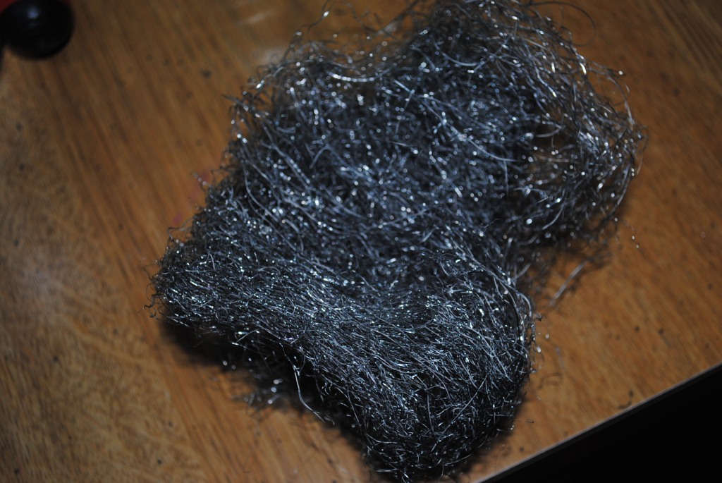
Brushed one coat over the entire surface.While still wet. I took a ball of steel wool and dragged it from top to bottom in one straight row, its’ important to apply the same pressure throughout the stroke. Then start again at the top of the next row and repeat until the end. Turn the steel wool as you go to avoid paint build up or you can wipe it on a paper towel, but that never seems to work for me.


 The end result is a soft linen look. I finished it off with the Metallic Gold circles (remember our inspiration piece, look at the seat cushion. That’s why I wanted to create a “linen” base, to emulate the cushion. Man, aren’t I clever :D)


So the whole piece took me about 20 hours (what took the longest was coloring in all the black and white checks & zebra print! Geeesssseeee!) so you can do this people! It can be done!

I loved how it turned out. Maggie was proud that I didn’t “girl it up!” Yes, it could actually be considered a masculine piece! Whoo! Hooo! My first one! I have a terrible habit of “Girling things up!”

Here's the damage:
Dresser: $5.00 (Thrift Store)
Kylon: $3.95 (Walmart)
Fence Toppers: $ 12.98 (Home Depot)
Paint: $6 (I only bought 3 new colors and used only a 1/3 of each)

Just and FYI, Benjamin Moore has pint size testers for 6.95 which I usually buy (unless its black or white) and they usually last me a long time so save yourself some money and space and get the smaller sizes.


Colors Used:
Benjamin Moore White Dove
Benjamin Moore Deep Rose: 2004-10
Benjamin Moore Million Dollar Red: 2003-10
Benjamin Moore Blue Lapis: 2067-40
Benjamin Moore Twilight Blue: 2067-30
Valspar: Satin Black


Happy Painting
Mary